Tuesday 31 January 2012

Design week

Just to warn you, this one is a bit wordy... There are some pics at the end as a reward though :)

Since it's interim and all our projects are getting marked, we cant really use our studio to do any work (and we're not supposed to have our new brief shhhh!) so CCAD has organised Design Week - loads of artisty types are coming in and giving lectures and workshops and we had to sign up to all the ones we wanted. Today was my first one, it was a lecture and a workshop by Dr Manny Ling, Calligrapher (we like him, he smells books too). The lecture was quite interesting - he was talking about his work and what inspired him - but I loved the workshop. I think it helps that I'm a very practical person and I like the 'doing' and playing bit best.

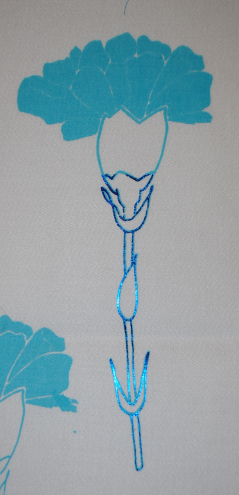
He taught us how to make a calligraphy pen out of a coke can (I think I was the only person who managed to stab myself in the knuckle though! No, mum, there wasn't really any blood... :) ) and he made us have a play with them drawing squiggley lines (he actually said his looked a bit like an ECG!) and 101011010110111011001101 a lot cos basically all letters are made up of the 1 and 0 shape to varying degrees. Then we got to try actual letters and writing our name just normally before he had us doing it in a more graphicy way (that confused me cos my N's looked like Z's at times) and something that looked like flowers but I wasn't too keen on my flower ones, I blame it on the fact my name has a J in it :) 

So, this is what I spent most of the afternoon doing..... 


They were the sensible ones but I wanted to do one with some really nice words on it, since I have a slight obsession with nice words, and these were the first ones that popped into my head. (Unfortunately, I didn't come up with them, if I had that would've been awesome...)

Vin Garbutt makes me :)

Tuesday 24 January 2012

Hand in

Just handed the printed and embellished project in! I can get reaquainted with this thing called sleep I've kinda forgotten about.
We also got our brief for our next project - us in the FdA group are making a bag based on florals and a cushion and tea towel based on an art period. Quite exciting!

Thursday 19 January 2012

Dun dun duuuuuunnnn.....

Final collections are all complete! WOOH! I've spent most of the day in the print room, freezing, gluing stuff to foil so I can finish them...

Anyways, here are my Embroidery ones:


These were done on cotton sateen (apart from the first one, that was some kind of wool that wasn't very nice to use) and have been done using various hand and machine stitches as well as some applique and dyeing.

And my printed ones:

These were done on habotai silk and cotton sateen using various procion and acid pastes, discharge pastes, pigments and some foiling. (The first 4 are silk and just look so nice, I think I have a slight obsession with silk - I did loads of work in AS Level with it too)
 
 I know they're a bit small but I think if you click them they get bigger and you can have a proper look. If they dont and you really want to see some more detail then just say and I can put them up big!

Tuesday 17 January 2012

Bzzzzzz Bzzz Bzzzz

^^Thats cos I've been a busy little bee :) I did another 2 prints - one on silk and one on cotton! One... well, one went quite wrong cos I didn't make the dye paste dark enough so it hasn't printed but I'm gonna go over it tomorrow and the other one is this! I quite like it...


The fabric dyed with this gorgeous texture where the dye had gone a bit weird (not sure why) but it needed leaves on it to go with the effect. I used procions and acids in blues and purples printed onto silk. I'm also going to pick out some areas in irridescent and blue foils so I'm quite excited about that!

Monday 16 January 2012

First final print!

And, I've done a print for my final collection! How organised am I :)  (I'm just not mentioning that some people have got loads more prints done that I think look better so shhhh) All the fabrics I dyed today came out really pale so I've decided that can be my theme and if we had to name our collections my print one would be 'Dream a Little Dream of Me' cos the colours are all blues/purples and they look all dream-like.


This one turned out so much paler that I thought it would and my camera - awesome though it is - couldn't focus on it cos everything was so pale! So I've just got a few close ups to give you the general impression. I dyed the fabric Bright Blue (but it came out pale purple...?) and printed with discharge, steamed it to fix, then printed with blue procion paste and steamed to fix. And somehow I was at college till 9pm doing this... Not entirely sure how it took about 8 hours but still, I quite like it :)

The end is in sight...

My third and nearly final embroidery sample! The little cup at the bottom took me forever to do cos it's all hand sewn and I wanted to cry after I bondawebbed the leaf on cos the iron made an awful mark on it but it's not that noticable any more so yey. Don't have much to do on my other one either so that can be on here soon...

Saturday 14 January 2012

More prints, with exciting new bits!

 Oooooh! We've had some more fun printing and some of the stuff we've done has been so cool!
We've done foils - where you print this special glue through your screen, wait for it to dry then iron the foil over it (you have to remember to put it with the colour up or it wont work, I keep putting it the wrong way round...), wait for it to cool down and peel it off and you're left with a beautiful shimmery bit!

 Then we had heat transfer and expantex/minerfoam which was almost as fun as the foils - the heat transfer thing works best on manmade fabrics like the one I used here and you paint a special paint onto paper in blocks/a pattern, and put it face down onto the fabric - you can trap things between like lace/buttons/paperclips/wool etc that leave a white mark - and put it in the heat transfer press till its cooked and it does this!
The Expantex/minerfoam stuff is very exciting - you print a normal looking paste through your screen and nothing happens till you iron it on the back and then it all starts to expand and puff up so it's 3D and textured! (Thats what I did the Rose in on this piece)

This is heat transfer on silk - it doesn't take the colouring up as well as it's a natural fabric so you're left with a really pale image that I quite like. Although it has come through quite well on the bit that has masking tape behind it!

This one is a mix of all the other printing techniques here (apart from the heat transfer) The big branch is just pigment printed, the little one is expantex and the rose is foils.

Saturday 7 January 2012

Print part one

Tra laaa... The print samples are dry and ironed (even though some don't look it, I don't think I let the iron heat up enough, I was too excited :) ) and here are some pics of my first attempt at printing!


This is an Acid dye (I think it was called Lemon Yellow...?) printed on a silk. It probably wasn't the best idea since you cant really see it on the white so I did some close ups for you of the best bits.


This is a Procion dye (Claret Red, very nice name) on a heavy cotton. This has come out a lot darker which is nice. Note to Self, dont use Yellow on White :)

These are Discharge Prints, you print onto already dyed fabric and the colour gets leaked out - like bleaching. I think the colour turned funny in some places - like my leaf on the black piece - because I didn't wash it out well enough (whops) but I really like the effect it left.

Friday 6 January 2012

Drum roll please.....

We've started printing today and I am so excited about it it's unreal!
This is a little preview to get you as excited as I am...


These actually took me all day to do, I nearly didn't have any dinner but then I realised that would be madness, then College went and shut or I'd have done some more.